User registration pages suck
Summary: you must relentlessly streamline the process by which a user joins your site and avoid even this process as long as possible.
In marketing lingo, it's called your 'conversion rate.' This is the percentage of users who you successfully convince to take some action. On the web, this usually means getting someone to
- Click your ads.
- Create an account, or
- Buy your product.
Today I'd like to focus specifically on the second goal. This is a topic that has not been getting enough coverage. I see the same mistakes being made on hundreds of sites, and they have significant impact on the user experience.
Let's start with an example.
Just this morning I read a blog entry on TechRepublic that I enjoyed. I was so impressed I decided to click the 'thumbs up' button to cast a positive vote for the entry.
Oops. "Access to this feature requires a free TechRepublic membership! Not a member? Click here to join now."
Bad already. I've tried to interact with this site in the tiniest way, and it is already committing the cardinal sin in sales and flirting: trying to close too quickly.
Slow down guys. I'm not ready to make an account yet. I just want to get to know you a little bit.
This is where I usually give up on a site. I did want to test out a feature or two, but I'm not invested enough to take the time to hand over my information and create yet another account.
However, for the sake of science, this time I pressed on. Here's TechRepublic's registration page:
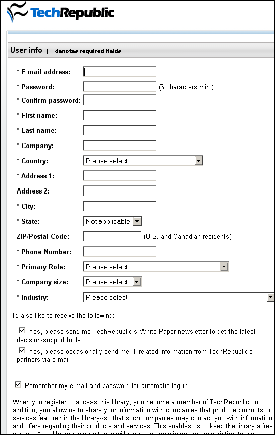
Wow! FOURTEEN required fields PLUS two "please spam me" check-boxes that are helpfully selected by default. This image is 860 pixels tall and you still can't even see the submit button yet.
Why oh why make this so hard? Attention spans on the web are notoriously short, yet this site insists that 'company size' be a required field. I disagree. TechRepublic does not need to know my company size for me to vote up that blog post, they want that information so they can sell it to their partners.
I feel dirty now. Let's take a cleansing look at a good registration page:
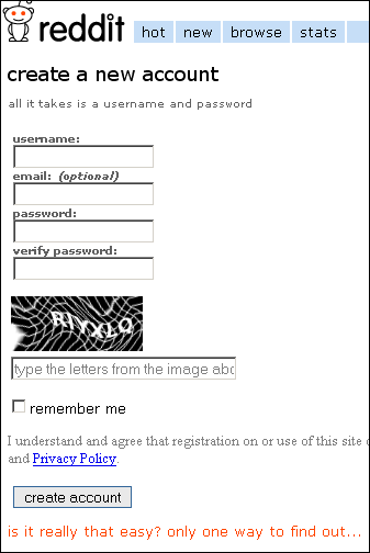
Ahhhh, much better. Four required fields, and one is just a captcha to make it hard for bots to create a billion accounts. There's a field for an email address, but it's optional! These are requests I'm willing to fulfill.
Let's wrap up with some straightforward advice:
- Think of forcing your users to register as a last resort. Deliver as many features as possible without registration.
- Do not withhold features from unregistered users to convince them to register. (Under certain business models, this may be unavoidable.)
- When users do register, streamline the process as much as possible. One page maximum!
- Keep required fields to a minimum. If you'd like more detailed information, allow users to enter it through a different page later on (optionally!)
- Consider eliminating password complexity requirements. If you're not holding sensitive data for them, let your users use any old password they prefer.
Happy New Year everyone.
Edit: yes, my comment boxes have name/website/email fields. All these fields are optional.