Making Github's Code Readable
I love Github. We recently decided to become paid customers at work, and I'm tickled.
I also can't stand reading code on the site.
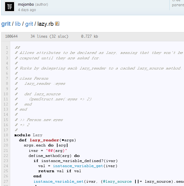
Why? Frankly, the text is plain old ugly:

Those italicized comments look like faintly-etched glass. And the bolded bits look clumsy as well (check out the 'm' on 'module')!
What's with the ugly? Let's ask Firebug:

'Bitstream Vera Sans Mono'? Never heard of it. Haven't got it installed. If you're on Windows or OS X, you probably don't either.
Okay, so I haven't got Bitstream, so it looks like we're falling back t--oh my GOD it's COURIER.
Yes, Courier. Invented in the 1950s. For typewriters. I think I last used this font while editing GORILLA.BAS to mess with the speed and gravity. No one should be using Courier anymore (unless you're writing a screenplay).
Fortunately, there are two easy ways to fix this. The first, you and I can do. The second will have to be done by the Github guys.
What we can do: install Bitstream Vera Sans Mono.
Installation is OS-specific, but I bet you can figure it out.
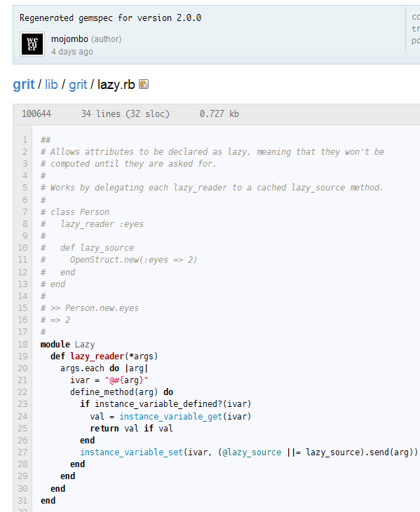
Here's how things look after the install:

Sweet mystery of life at last I've found you! This is about...a billion times more readable.
Now, the experience of not having their first-choice font shouldn't have been so painful. If you're going to lead with a talented but fragile rookie, make sure you have a dependable second-string something something sports analogy.
Anyway, the Github guys should change 'Courier' to 'Courier New' in their stylesheet. Courier New is an updated and refreshed grand-child of Courier, and it's far more readable, especially when bolded or italicized. Plus it's just as widely installed as Courier.
Little change on our side. Little change on their side. Code looks beautiful; everyone's happy.