Making OpenID Usable
During the Rails Rumble '09, OpenID came up a lot in the #railsrumble IRC
channel. A lot people had implemented OpenID in their app, and there was
some surprising grumbling from judges who didn't like it.
The grumbling surprised me at first: I like OpenID. But I think I've figured
out why these judges didn't: it's easy to do a crappy login page.
Here's an example of a really unfriendly OpenID login page:

Yikes.
That blank white text box is like an iron door between me and this site. I am a
nerd AND an OpenID proponent, but I do not have my provider's URL memorized.
Even if I did, it's a drag to type: "https://www.google.com/accounts/o8/id"
(Incidentally, Googlers: can we get https://openid.google.com for this? C'mon,
that's kinda cool, no?)
So, please don't ever make me go look up my OpenID provider URL. Particularly
if I'm using someone as large as Google for a provider.
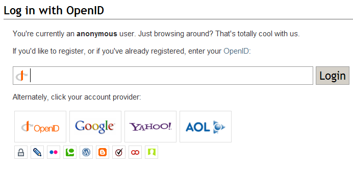
Okay, cleanse your palatte and let's check out an example of an EXCELLENT OpenID login page:

Kudos to you, SO team. This page kicks ass.
Stack Overflow gives me exactly what I want on an OpenID login page: a huge button with Google's logo on it.
Not only that, but they've shrunk the buttons for the less popular providers. I love that sort of touch in software.
If you're going to support OpenID, please read the organization's Best UX
Practices. Or maybe Yahoo's OpenID Usability Research.
Then just go copy StackOverflow's page.
I think we should shoot to have all OpenID login pages look like siblings: possessing a thread of sameness despite their differences.